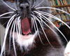
LIKE A TINY HELICOPTER. A BUMBLEBEE IN BARNES LAST SATURDAY
A bumblebee in the woods, hovering an inch or two above the ground, landing, taking off again. The turbulence from its wings is so strong, it displaces the earth underneath and makes small pieces of dry wood fly up in the air.
14 July 2011
NATURE
This morning, while cycling to the computer fair, I came across a strangely spectacular scene: in the middle of the street, a big seagull was pecking a bloody pigeon carcass before deciding to drag it to the side of the street for more leisurely pecking. A couple of not-dead-yet pigeons were loitering nearby, looking disinterested.
And right now I'm on a train from London to Penzance, looking out of the window, counting rabbits. A while ago we passed a green patch that was full of black rabbits! I was hoping for more, but all the other ones I've seen since have just been normal rabbit-colour. I wonder if the black ones were all members of one particular mutated family. The Black Rabbits of Totnes.
18 June 2011
ART
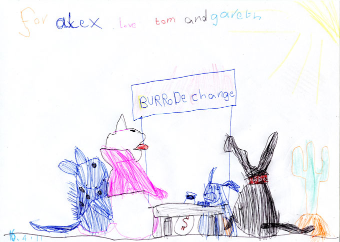
My show at Prick Your Finger is now officially finished (I'm taking it down tonight). Last Saturday when I was in the shop all day, supposedly to knit a cactus but really mainly to drink tea and hang out with friends, Gareth and his son Tom came round. Tom is 6 years old, or 6 years and 3 quarters to be precise, and he made this beautiful drawing of my show. Thank you Tom! I particularly like the furry coat of the creature on the left, and the fact that you can see the donkey's sack full of dollars under the table.
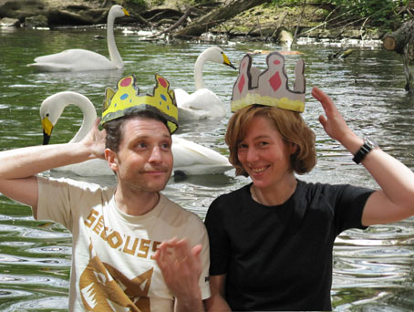
Another great thing that happened that day was that my friend A.J.Holmes the famous pop star came by. We drank lots of tea and ate marzipan (which my brilliant mobile phone's predictive texting wanted to turn into MARXISM), and Rachael, always easily impressed by pop stars visiting the shop, took some pictures of us while we were borrowing Kate and Wills' crowns. Note the pretty swans in the background.
20 April 2011.
BLOGTASTIC!
My show is in Amelia's Magazine!
And also Prick Your Finger did an amusing blog entry about my cactus-knitting day when lots of pop stars came round, "lots" in this case meaning two: Leafcutter John and Professor Scanner!
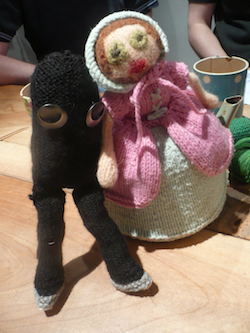
And this lovely picture was taken by Rachael Matthews, one of the two wonderful ladies who run Prick Your Finger. It shows Friend (a knitted black creature that I got for my birthday from Andrea Voisey) and Mrs. G (Prick Your Finger's resident tea lady) being quite close to each other. You can read more about them here.
18 April 2011.
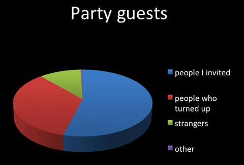
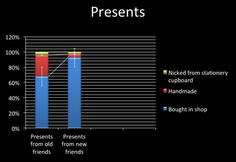
A REVIEW OF MY BIRTHDAY
Recently I celebrated my birthday at the Horse Hospital. A lot of people turned up, and I had a great time. I made a couple of charts to document what a success the party was, so I can always look back at them to remind myself of that special day. I must say I am quite pleased with my phenomenal PowerPoint skills!
17 April 2011.
FILMS ONLINE!
I have put two of my films online. You can visit my vimeo page to watch them.
10 April 2011.
BURRO DE CHANGE
My show BURRO DE CHANGE is still on at Prick Your Finger. Today Saturday 9th and next week Saturday 16th April I will be there all day knitting a cactus. Drop by if you have a chance! The very kind ladies at Prick Your Finger blogged about me too!
09 April 2011.
THE TERROR OF THE DALEKS
We went wandering around Charlotte Street tonight and we came across a Dalek in somebody's ground floor window. A real proper big shiny Dalek. Strangely, it was not in the least scary. But then, honestly, how can something be scary if it looks like it was designed to make cake batter with one hand and clean toilets with the other?
08 Febuary [sic] 2011.
FOR CHARLES HARRISON??
Last night I went to Karsten Schubert gallery for the opening of For Charles Harrison: When attitudes became form, a collaborative exhibition by Richard Saltoun and Karsten Schubert "adapting the premise of Harrison's seminal exhibition When Attitudes Become Form (ICA, London, 1969)" (quoted from the press release). It was also the book launch of Ridinghouse's Charles Harrison Looking Back. At first glance, there was everything you could wish for at an art opening: good art, some of it great, free drinks including champagne, and lots of famous people including Sir Nicholas Serota. (I said to my partner, "Do you think Nick Serota is a bat?" He asked why I would think that, and I said, "Because there's a bat called Serotine bat." — "Why don't you ask him?" — Well, I was too shy to ask, and so I still don't know if Nick Serota is a bat. If you know, please send me an email.)
But then I picked up a list of works to find out what I was looking at, and I found something on it that I was really excited about: No. 5, Art & Language, Map of 36 square mile area of the Pacific Ocean west of Oahu, 1967, letterpress print on paper, 63 x 52 cm. I had only seen it reproduced in books before, and it is a wonderful work which references the sea chart in Lewis Carroll's The Hunting of the Snark. There were 26 works in the show, and with all of them being displayed in no particular order, it took me a while to find it: incomprehensibly, it was not in one of the two gallery rooms, but sitting on the floor in the corner of the office, next to the door that leads to the toilets, underneath a rather bad work by Mark Wallinger that wasn't itself part of the show. It looked like they had forgotten to hang it. And there wasn't a number 5 next to it on the wall either, so it really didn't look intentional. My partner pointed out Richard Saltoun to me, the curator, and we both started (admittedly slightly drunkenly) to apprehend him: why on earth was this piece leaning against the wall in the corner, and not part of the show, when according to the list of works it clearly should be? Mr. Saltoun looked very slightly embarrassed for a second and then told us in a jovial and facetious manner (inbetween meeting and greeting people constantly) that he thought Art & Language were not really that interesting compared to the other artists in the show, and that you could always go to the Lisson if you wanted to see Art & Language.
Wait a minute. The title of the show was WHAT again, exactly? FOR CHARLES HARRISON?
I thought this was shameful, terrible, a travesty. We left the gallery, for they had run out of drinks, and continued drinking elsewhere until we were very drunk.
13 January 2011.
BOOKARTBOOKSHOP
Very exciting news! From today, a selection of my books is available from bookartbookshop in Pitfield Street off Old Street in London. My books and handprinted postcards are presented on a custom-made POS (Point of Sale) which looks so imposing that you can't really miss it.
Posted 3 December 2010.
APOLOGIES TO MICK HUCKNALL
The Guardian website informs me of "Mick Hucknall apologies to thousands of women he slept with". I salute this noble sentiment and would like to take this opportunity to send my heartfelt, sincere apologies to Mick Hucknall for not sleeping with him. I know I probably hurt his feelings, and I am deeply sorry.
Posted 3 December 2010.
TERMINOLOGY ON YAHOO. AN OBSERVATION
When I visited the yahoo website the other day, the very top line of text that appeared was: 'Trending: Leslie Nielsen'. Oh, trending, is he?! And there's me thinking he's dead! Hahaha! — This morning, I couldn't help but notice that trend is more transitory than death: Leslie Nielsen is still dead, but the trendy thing now is Tokyo Earthquake.
Posted 30 November 2010.
BOOKARTBOOKSHOP, SUKI CHAN, ART & LANGUAGE
Yesterday I went to Bookartbookshop in Pitfield Street to show Tanya, the owner, my books — and I am pleased to announce that very soon my books will be available to buy there. On the way back home I made a little detour to look at some art. First I went to Tintype Gallery in Redchurch Street, where I recently saw Serena Korda doing a closing performance for her show: she and her sister did a puppet show of Walt Disney and a lady mountaineer whose name I forgot, a woman who allegedly climbed a mountain top on her own several times but failed to verify it. The show was charmingly amateurish in the way it was performed — a bit like children act out scenes with dolls — and yet at the same time it was obviously very carefully planned, with a beautiful soundtrack, and the way it was using a cupboard as the setting (with little scenes and landscapes built inside and a mountain on top of it) was really good. The new show there is Suki Chan, who I hadn't heard of until I watched some TV programme the other night in which Saatchi finds the next superstar and she gets to be among the six chosen ones — handpicked by a panel including Tracey Emin and some annoying art history dude who makes really boring comments — who get to make some new work in Saatchi's East London studio. The programme was pretty repulsive. We watched up to the point where the six chosen ones get to go to Hastings and are paired up to be inspired by different sites in Hastings to make some sort of big sculptural work, with the condition that it has to be "accessible". To add insult to injury, Saatchi's assistant (because he himself never shows up, of course) brings Martin Creed with her to have a go at all the artists that they don't do the kind of work that he would do. His advice to them, predictably, is to make things simpler. He slags off one duo's plan to build "ghost houses" next to fishermen's huts, in the space where according to photographic evidence they found there used to be two more of those huts. I thought their idea was very good, but Martin Creed doesn't get it and therefore thinks it's pointless and rubbish. Nobody challenges him on the pointlessness of his own art, which this reviewer finds rather vacuous.
Anyway, we stopped watching at that point. The Tintype show has several photographs, some of them with text written by the artist about the specific location (including places in Beijing, Mongolia, London, Berlin). There is a sort of documentary approach mixed with something very personal, her texts are her own observations and thoughts about places and people. Then there are five television sets next to each other, all simultaneously playing different films. I concentrated on the first one, and it was sometimes difficult to understand the dialogue in it as the film next to it picked up in volume (there are no headphones, so you get the soundtrack of all the films getting mixed up). The films were all about rice, and I think they were made to be shown on television; the one I watched showed various people in China being interviewed about what rice means to them, and again, like in the photographs, it was a documentary with a very personal touch, with people telling anecdotes of eating rice, or growing their own rice, or how a huge amount of people starved to death under Mao when they abandoned farming in favour of trying to compete with the steel industry abroad. One scene I particularly liked was when a young woman talks about how she injured herself as a child, falling on her chin, and she mimes how then she had to eat rice barely being able to move her jaw, and the camera starts shaking as the camerawoman starts laughing at her story. At first I thought it was a bit annoying that there were no headphones, as I sometimes found it impossible to hear what was said, but then, I liked how it worked as a whole, with the different screens showing people being interviewed alongside landscapes and people in rice fields, and the mixed up soundtracks created an atmosphere that would have been absent if they had all been on headphones. Next to this, slightly inexplicably, was a mirror shelf with hardcover books cut in half, so the spines were facing the viewer and the cut–off sides were reflected in the mirror on the wall. Then a huge film still from a film shot in London at night, and next to it the film itself, a big elongated plasma screen with two films playing alongside, with two pairs of headphones (I think with one soundtrack, not two different ones). The film is basically a night journey in London, including scenes filmed from the front window of the tube, with the train driver talking about his work, which is not recorded to be the main focus, it's hard to understand everything he says as it is mixed with other sounds. It is beautiful and a bit eerie, and odd to see very familiar scenes filmed by someone else, for example streets like London Wall where I've cycled a few times and marvelled at the glossy inhumanity of some of the architecture, and the public art that does nothing for the public, or that 'artwork' made up of dozens of traffic lights on a traffic island somewhere east that my partner always rants about when we drive past there, as it's not only quite pointless but also potentially dangerous for drivers. The next piece in the show, which I initially missed until the very nice gallery assistant pointed it out, was a little animation projected into a corner high up on the wall, which was beautifully done, it had a line of text made up in neon light and then was switched off word by word. The other two pieces were neon signs, one was English text going in a circle, done in a handwriting style, with words that (I guess) people had said to the artist about rice, like "boring" or "white", the other was a line of text in Chinese, which also looked very much like handwritten characters, and the gallery assistant read out the translation to me, it was also a quote about rice. Overall I thought that maybe it would be a stronger show if it had focussed only on the works about rice, rather than mixing it with the London pieces, but then again, all the work is very good so I was happy to see it. Funnily enough, my partner had similar reservations about Serena Korda's show, saying that she was a bit young to have a retrospective and it might have been better to be more focussed.
Then I went to Karsten Schubert gallery as I found out they have a new group show which includes a piece by Art & Language. The piece is called One Year, it is from 2005, and I found it very clever (OK, that goes without saying) and utterly hilarious. It consists of twelve framed images, they are all photographs and each of them has one person photoshopped or collaged into it (I don't actually know or care about the exact process of how these were made) and painted over — the photos are of various surroundings like art museums or galleries, one space which has a map of New York including Ground Zero on the floor and pictures of terrorists on the wall (not sure where that is, I assume it is an art piece), another one is a photo of a big rave. The person "photoshopped" into the image is standing, sitting or kneeling in the middle of it in a gesture of theatrical despair, utter disbelief and comical rage. I thought the people were the artists themselves but as I didn't know what they look like, I checked with one of the ladies working there, and she confirmed that they were indeed Mel Ramsden and Michael Baldwin. She said that supposedly one of them was of Charles Harrison but she wasn't sure which one. I couldn't make it out either and I guessed it was the one where you see someone photographed from above, i.e. you just see the back of his head.
Posted 20 November 2010.
Lords of Chaos
I've been reading Lords of Chaos (published by Feral House) for several months now. To be more precise, I started reading it several months ago, got quite far pretty quick, then could not bear to read any more and put it away for a long time. I picked it up again last week and chances are I will actually finish it this time.
I was initially interested in the book because a few years back we had an exhibition at the Horse Hospital of Peter Beste's photographs of the Norwegian Black Metal scene which was very fascinating, particularly one photograph which had a guy in corpsepaint posing for the camera in a suburban-looking street, while an older woman walks past giving him suspicious looks, which showed in an instant how the people in this scene are worlds removed from the reality they live in, how sad and pedestrian the life is that makes people attempt to live life on the edge by turning to Black Metal, and how this attempted escape is itself rather pathetic.
I borrowed the book from a friend, after another friend had told me how "hilarious" it was, and to begin with I found it very interesting, as I knew hardly anything at all about Black Metal. It starts off with a history of how Black Metal evolved, then goes into the grisly details of the murderous friendship of Count Grishnack / Varg Vikernes and Euronymous, and various people around them. Where the book kind of lost me was when the authors attempt to connect more or less isolated events of racist / homophobic / arsonist attacks on people and churches and conjure up some kind of global conspiracy, making the whole thing into some glorious anti-Christian movement which supposedly will gather more pace and more members over the years and continue to spread mayhem, chaos and murder to overthrow the wrongful Christian rule over Europe. Interesting as it is to read about all the bands involved in this scene, it's difficult to take the book seriously when it gives completely insignificant stupid boys from stupid provincial bands a platform to spread their racist, white supremacy bollocks; about half-way through the book it gets really boring, as nothing is added by printing yet more interviews with confused stupid men who if they weren't completely deluded would easily recognise just by looking in the mirror that they themselves are great proof that their theory of the supremacy of white man is incorrect.
I get the feeling that the people in the scene who have burned churches or killed people think of themselves as some sort of amazing evil creature from Lord of the Rings or the Horsemen of the Apocalypse, but the reality is that their lives are probably rather unglamorous, seeing as they tend to end up in prison.
Overall, the book is well worth reading if like myself you knew nothing about the Black Metal scene; but as my friend warned me when I borrowed it, it is cryptofascist, which if you're that way inclined might make you worse, but if you aren't you're more likely to just get a bit bored. Also I must say that reading it — despite the authors' desperate attempt to blow up some cases of arson and murder into an apocalyptic movement of global proportions — destroys the myth created by Peter Beste's photographs: even though they show the pathetic element of it all, they convey something grandiose. The music itself does that too. The real-life stories don't.
And this is what Mumra thinks of Lords of Chaos.
Posted 17 November 2010.
THINGS by Keith Wilson, 12-22 October 2010 at Wellcome Collection
The Wellcome Collection is currently showing an exhibition by Keith Wilson entitled "Things". You can go in and drop off a thing and it will become part of the show. It is organised like a big calendar, so each thing is assigned a date, and it will be complete when there are 365 things in it. I went in today to drop off a thing — after some deliberation (about 1 minute!) I decided to hand in my cat-in-a-box, a little screenprinted cat based on my real cat Mumra, which is placed inside a wooden box with a glass front, and to make it less like a cat in a box and more like a cat in its own living room I put some Liberty's patterned fabric on the walls and I cut out a small reproduction of a Black Cat fireworks ad on the wall, so the cat has a cat poster.
Initially I intended to give it as a loan, but when I handed it in to Keith Wilson, he asked whether I'd consider giving it as a gift instead. I asked if it would end up being thrown away, and he assured me that on the contrary, it would be part of the collection which after the Wellcome show would go on to travel to different places to be exhibited with all the other gifted things. So I said yes, because the box itself was assembled for an exhibition two years ago and since then it's just been sitting on a shelf at home gathering dust. I am attached to it in some way, and I liked having it around, but I wasn't planning to exhibit it ever again, so it felt like it had served its original purpose and was in a kind of undead state where it was still hanging around but pointlessly hidden away at the back of a shelf. So I was really happy to pass it on to someone else's collection which is actually going to be seen by people. I was also very happy to have taken it out of its normal context, where it was surrounded by old toys and objects, and giving it a new world to exist in where it has a new meaning, surrounded by all sorts of things that other people have chosen to give. I asked Keith how many things were given as gifts and how many as loans, and he said it was about one third to two thirds - one third gifts, two third loans. I am assuming this means that as the collection travels to other places, local people will fill the boxes that are empty because its contents have been returned to their owners, making it a different collection every time.
I think it's a beautiful idea. I like it better than Michael Landy's Art Bin, where people were invited to contribute a failed artwork and throw it into a huge bin, exhibited for a while and then destroyed afterwards — although I thoroughly agree with destroying failed artworks, but I think I can do that myself if I want to and I don't see that much point in making it part of somebody else's artwork in the process. But contributing to Keith Wilson's show, giving something away and thereby not only making more space in the flat but at the same time giving an almost-forgotten thing a new purpose, made me happy.
The private view will be on Tuesday 19 October, if you contribute a thing to the show, you will be invited! (You can bring things on Sunday 17 and Tuesday 19 October.) The link is here: Wellcome website
Posted 16 October 2010.
BERLIN TRIP
I went to Berlin at the end of March with a group of Kingston University graphic design students and two of their tutors, Cathy and Mark (I am a visiting lecturer there, teaching basic bookbinding). It was great fun, in a very busy sort of way, we were visiting design studios, galleries and museums every day and met lots of interesting and inspiring people. One visit that was particularly interesting (for me at least, not sure what the students made of it!) was going to see Catriona Shaw a.k.a. Miss Le Bomb in her studio. I didn't know her before but was very intrigued by the things she's put on her website, as she's done such a variety of things including drawing, singing in a band, making videos, doing performances on her own and with other people. She talked to us about her experience of moving to Germany (she's from Scotland), what it's like living in Berlin etc., and also told us a bit about the performance she was going to do at a gallery the next evening. She said it would include a powerpoint presentation, a bad talk about architecture, and various other things. We all went to the gallery the next day, it was fairly small and completely packed — and there she was with her friend, both dressed in tight golden catsuits looking very glamorous, and they did about half an hour of a rather baffling and often very funny performance, miming to a music video, showing pictures and talking, with no apparent relation between the words and images, doing a bad talk about architecture, playing amplified guitars to a plaster artwork in an attempt to make it crumble (which it did, partly), and showing a super 8 film. And probably a few other things I've forgotten. Cathy, Mark and I all really liked it, the students hated it. I guess they probably hadn't ever seen anything like it and had no idea what to make of it. I really liked the humour in it, and they way they do things without rehearsing very much (at least that's what Catriona told us beforehand) — there is the possibility of it becoming quite painful or embarrassing for the performers and the audience. Also of course I really liked the powerpoint presentation, as I've spent some time working in offices and therefore have a long history of hating Microsoft Office. Although when I first started, I don't think it was called that. I used to work with Word Perfect and various other versions of Word, I think that was before they invented Microsoft Office. Also I've seen Powerpoint used on many other occasions, including a training course on how to start your own business which I went to in Berlin, which as far as I remember was a revolting mix of Powerpoint aesthetics and marketing terminology. Arrrgh!
Other highlights of the Berlin trip include visiting Buero fuer Film und Gestaltung, who talked in some detail about a few books they designed for Olafur Eliasson; Colors and the Kids, who showed us moving image work which was a very inspiring mix of very hands-on film (like filming people's hands doing things) and very complex 3D computer animation, and also great because of their very fearless use of colour. Also the visit to Bongout in Torstrasse, who very kindly not only talked to us about their gallery space but also opened up their studio next door so we could see their screenprinting facilities. It is a rather small space, and a lot of things are homemade as they had no budget for a big professional studio. Great to see how you can do your own thing if you have the right space and a bit of a DIY spirit.
One afternoon when I had nothing else on, for a change, I went to Hamburger Bahnhof to look at some art. I'd looked up on their website what was on and found they had an exhibition by Walton Ford, who admittedly I'd never heard of before, but it looked really interesting — large-scale paintings inspired by book illustrations of wild animals, with text mounted next to them. Also Mark went to see it the day before and he said (this was after I had a tutorial with him at Camberwell in which I showed him my work in progress) that it was fantastic and I really should go and see it, I suppose because a lot of animals feature in my own work too. So I went to see it, and it was quite amazing. The write-up it got was about how different the artist's practice was from a lot of other contemporary art and how it seemed not the fashionable thing to do and was therefore all the more amazing (this is written from memory and totally reworded by me and possibly bears only little relation to what it actually said, but this is how I remember it). I'm not sure if that means anything and if it's true, but certainly I hadn't seen anything like it, first of all it did remind me of book illustrations, but the things were so huge that just their size was astonishing, and it made me think that buying the catalogue would be really pointless because reducing them so hugely to fit them inside a book would really do them no favour at all. So, the first impression was, these are really BIG. The second, they are beautifully painted, and they have animals on them, which is always a good thing. Then, as you take a closer look, you see there is text scribbled into the corners and margins in pencil, sometimes so weak it's difficult to make out, which makes you want to read it even more. I can't quite remember now what the texts were, but they were different from the texts typed out and mounted next to the images, which were excerpts from the original texts that inspired the paintings, some of them from adventurers and explorers. I remember at least one of the texts had a very striking reference to the present, it might have been something about the internet, which seemed curiously out of place when all the scenes depicted in the paintings happened over 100 years ago. And then, of course, you also realise as you read the texts displayed next to them, that they are all quite terrible and sad, and what's worse, they are all based on accounts of events that really happened. The delay of the realisation what you were looking at is, I think, what made it so intriguing: the first impression that you were looking at some beautiful painting, and soon after the realisation that you were looking at something grotesque, violent, cruel, or terribly sad, like one picture of a mob of people burning a tree and two bear cubs falling off a branch, or a panther escaped from a zoo in the foreground, and another mob of people approaching far away with torches, hunting the cat. The longer I looked at it, the more it upset me, and in the end I fled and looked at more reassuring art by people like Donald Judd, Gordon Matta-Clark, Marcel Broodthaers etc.
(That last bit about those artists being "more reassuring" was, of course, a joke.)
Posted 23 April 2010.
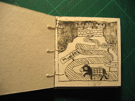
TEXT FOR THE BURRO STORY
I started writing the text for the Burro story. At first I wasn't sure how to do it, I just knew I wanted it to be in Spanish, and not in very good Spanish. So asking a native speaker to translate it for me wasn't going to work, as the Spanish would have been too good, and writing it myself using a dictionary would have been not good enough. So I decided to write it in English and use a machine translation. Perfect!
El Burro y los Muebles
El burro vive en un desierto entre las mesetas. Él
vive en sus el propio. Hay un cacto al lado de donde él vive. El burro
quisiera un poco de muebles. Él va en una búsqueda para los muebles. Él
camina por un tiempo largo, largo. Él viene a encrucijada con muchas
muestras que señala a muchas tiendas de los muebles.
¿Qué manera debe él ir?
¿Dónde están los muebles?
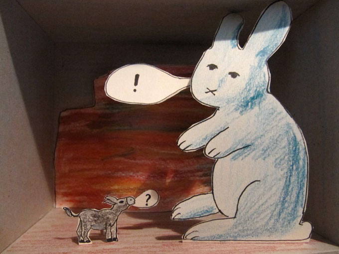
Él pide el conejo grande. Él pregunta a buho sabio. Él pregunta a policía insustancial.
El conejo grande dice: Vaya a Ikea. El buho sabio dice: Vaya al
castillo de los muebles. El policía insustancial dice: Los burros no
necesitan los muebles. Usted está perdiendo policía mide el tiempo.
Salga o le arrestaré. El burro decide escuchar el consejo del buho. Él
busca para el castillo de los muebles.
(Translated from English to Spanish by Yahoo! Babelfish.)
Posted 12 February 2010.
MORE BURRO, MORE MUEBLES!
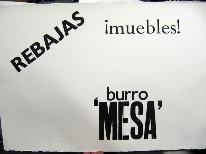
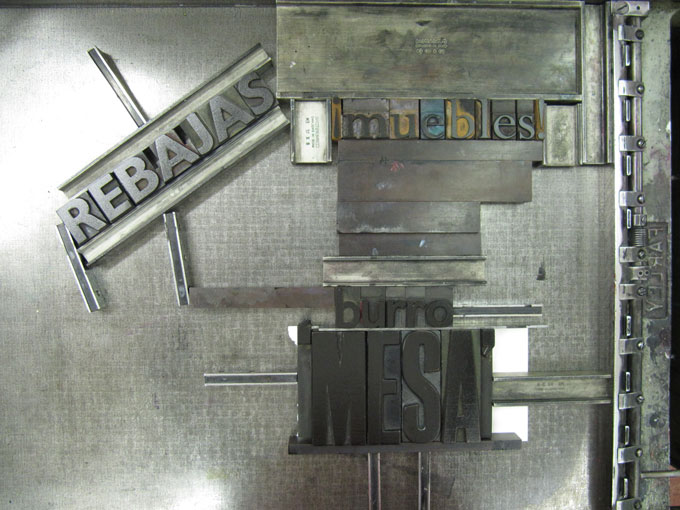
I made some burro boxes last week and a sketch of the Burro scene in letterpress yesterday.
Posted 12 February 2010.
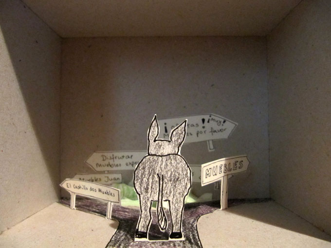
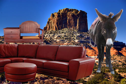
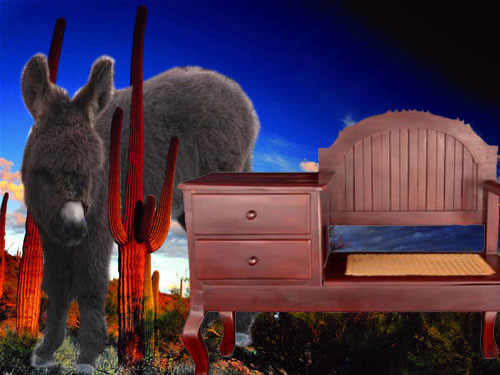
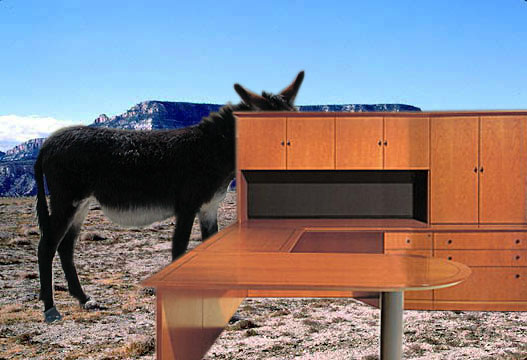
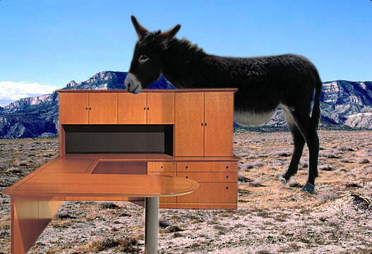
EL BURRO Y LOS MUEBLES
I did some work on El Burro y los Muebles. I grabbed some pictures off the internet with landscapes, donkeys and furniture, and collaged them together in Photoshop. With these, I wanted to try out what sort of feeling I would get from just using pretty much the first best images I could find, and I'm quite happy with the way they turned out, they capture the sort of feeling I'm after. The next plan is to make some really stupid webpages using found images of burros, quite possibly with the burros and the muebles moving around. I'll try to do that in Javascript or CSS if I can figure out how to, or a flash animation if all else fails —although I'd rather not because I don't believe in using flash on websites. (Maybe I should add that I do all my own website stuff, despite the fact that I don't know very much about making websites. I was shown a bit by a friend who is a proper web designer, by which I mean not a graphic designer but someone who makes websites, and I'm teaching myself as I go along. The resulting website is obviously not very graphic-designerish, and rather clunky, which is exactly what I want. I consider making the website a part of my work, and making some burro pages is part of the whole piece about the burro and the muebles that I'm planning to do, not only as a way of collecting ideas and preparing the more practical work but also a piece in its own right.)
So here are the images that I just made. I chose pictures with the search terms "Arizona landscape" and "mesa" because I imagine the burro to be in some sort of fantasy landscape between the Arizona of Max Ernst and Coconino Country as invented by George Herriman.
Posted 31 January 2010.
SOME MORE REFLECTION
When I had my feedback tutorial with Finlay and Rebecca, it was suggested that I need to be more aware of what other artists are doing, and think about where I would like to be positioned in the art world. Whether I want my work shown in galleries or in other places, which artists I think my work should be shown alongside with, etc. Several artists were mentioned whose work I should look at, including some I knew about and some I didn't: Helen Maurer, Sophie Lascelles, Bob Matthews, Mark Harris, Rebecca Warren, Joseph Beuys, Marc Quinn, and specifically for use of colour, Bridget Riley and Paul Gauguin.
So here is my terribly reductionist comment on each of them:
- Helen Maurer: Yes
- Sophie Lascelles: Yes
- Bob Matthews: No
- Mark Harris: hmmmmm...
- Rebecca Warren: Yes
- Joseph Beuys: Yes
- Marc Quinn: No
- Bridget Riley (colours): Yes
- Paul Gauguin (colours): Yes
Posted 27 January 2010.
REFLECTION
At a recent group crit (late last year) some of my work was criticised — my letterpress books Constant Pain and 16 Murders and a Stonecutter in particular. Criticism included some things I agreed with (letterspacing wasn't great, it would have helped to spend more time on them), some things I really didn't — particularly Garry's criticism of my use of different fonts in Constant Pain — this is just something that you can rely on hearing if there is a graphic designer in the room, I think it is because that's what they teach you in typography classes. But ACTUALLY it can look really good to mix up the fonts, particularly when there is no particular reason to do everything in the same font; and as all the bands named in the book are different, I don't see any convincing reason why the fonts shouldn't be. Also his comment about using different sizes of the same font on the cover of 16 Murders, which I did because I thought it looked good that way. I still think it does. It is very common for people to look at other people's art and say "Why didn't you do it this way?" etc, and generally I think a very valid answer is "Because I'm not you". Finlay also criticised the choice of colours for the cover of Constant Pain, saying that it would have been better to make it look really solemn and tasteful, i.e. with a black cover, or so outrageously garish and horrible that you could see it was intentional. If any of those I'd go for the latter, as after years of graphic design training and work, I got really sick of slick, tasteful graphic design (hence my decision to make my own website, and not use black text on a white background EVER). And also I must say that I didn't really agree with any criticism of the other book, 16 Murders; it is exactly the book I wanted to make, and despite the fact that nobody whatsoever commented on how well crafted it is, I'm quite proud of it, as I can really see how my bookbinding skills have been developing since I started working (irregularly) for Book Works and a book restoration place last year.
I also showed a bronze sculpture in quite an unfinished state, which Finlay liked best out of the whole lot (out of my work I showed that day, I mean) — although it was in a very unfinished state. It still is, it needs lots of filing and tidying up. And there was the print I did for the box set we did last summer, which I brought along because hardly anyone had seen it. Finlay's criticism was that it was a promising start of something that I hadn't taken any further. I admit that he has a point there. To me it's not something that I've started and then abandoned, rather I think I start lots of things and then start other things and it takes me a while to get back to them. Sometimes it takes me a really long time. On a 2-year MA I guess it would be better to be able to concentrate on one thing and not let yourself get distracted by something else you want to do, so I'll have to work on being more focussed.
Then, we had another group crit (with Finlay and Rebecca Fortnum) last week. Most of the discussion was about the whole exhibition itself, the way it was hung, the decisionmaking involved in grouping things in a certain way, etc. In the end, the two pieces that were singled out to talk about included my framed version of the book 16 Murders. Interestingly, I heard more positive than negative comments, Garry and Dan liked it, two other people told me they thought it was the best piece in the show (for whatever that's worth...) Rebecca said the fact that it was difficult to read the words (partly because they're printed in an awkward font in black on black paper, partly because the glass of the frame was reflective) didn't put her off at all, she thought it just made it more intriguing. Also she said it was very sculptural and solemn-looking. Finlay pointed out that the day before, there were many much more unkind comments, I can't exactly remember what they were (and I wasn't there myself as I was ill) — but I believe there were comments like "it's impossible to read, it looks very self-important" etc. I think the fact that I like it and some other people do too is enough for me; you can't please everybody. I also think it probably helped that there wasn't a title on it — for those people who weren't willing to give it a chance a title wasn't necessary, and those who were were free to make their own interpretation, rather than be influenced by my own. In the case of the book, I called it 16 Murders and a Stonecutter because it has 16 band names ending in -cide and one word, Lapicide, which I initially thought meant to kill hares, but which turned out to mean 'stonecutter'. Finlay suggested that it would have been much funnier if I had called it "Many band names end in -cide". I do think that would have made a good title, but when I saw people's reactions in the exhibition, I was glad the framed version was untitled, because some of the people who liked it liked it in quite a serious way. If the title had pointed out to them that it was a bit of a joke, they would have seen it completely differently, and as it is, I'm very happy that people read it in different ways. I hadn't thought of it in any serious way at all, so I was particularly amused about the comment that it looked very self-important; and I was quite surprised (and happy) that some people saw it as something more serious than I had intended it to be. Maybe if it needs a title it should just be -CIDE. Or maybe it's better off without?
Posted 26 January 2010.
NEW WORK
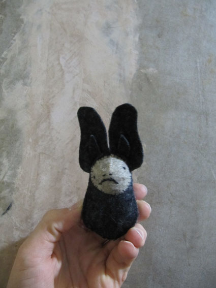
This is a commissioned piece for a friend: she wanted me to make a bat that carries a head, to accompany a story she wrote. The bat is much more batlike than previous bats I've made. (He is based on the Grey Long-Eared Bat, or Pletocus austriacus.) Now that he's finished, I want to keep him! Note that the ears are complete with tragus (the tragus is the pointy bit inside the ear). I'm pretty sure I'll reuse this bat for one of my diorama ideas. Its feet are backed with velcro and the head is knitted, so the bat can actually really carry the head.
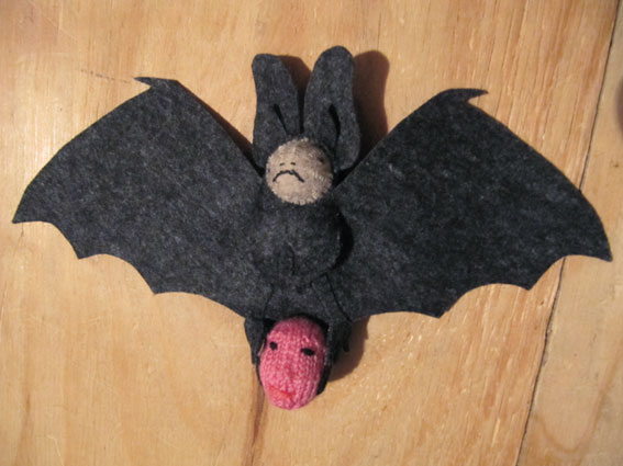
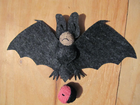
Posted 24 January 2010.
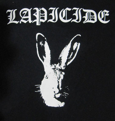
LAPICIDE
This is a t-shirt design I made in December for the exhibition at the Horse Hospital. It is an offshoot of my letterpress book which is a collection of bands whose names end in -cide, Lapicide being a Finnish all-female Black Metal band that I've made up. Lapicide to me sounds like it means to kill hares, but actually it means STONECUTTER. Of course the design is an homage to Bathory's fabulous t-shirt with the name Bathory written in the same font (Old English) and the image of a goat's head. When I talked to Savage Pencil at the show opening at the Horse Hospital, he asked me if it was a reference to Bathory, and if I was impressed that he'd noticed. Well, I was, but then to be honest I'd expect nothing less. He is, after all, Savage Pencil. Funnily enough this t-shirt didn't get any sort of reaction / recognition when I showed it at a group crit in college. When I showed it at the Horse Hospital, a few people thought it was fantastic, or at least very funny. I had been warned that printed t-shirts are probably deemed lowest of the low in art colleges, hehe... but to people who are into metal t-shirts they are an art form. So there.
Posted 24 January 2010.
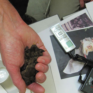
PHOTOS
At a batworker training day in December. The bat is permanently damaged from an injury and is being looked after by a licensed batworker. It was greedily eating mealworms. Click for more pictures.
My brother's pets. They are not axolotls but are closely related to them. They are called Andersons Querzahnmolche in German, Ambystoma andersoni in Latin, and Anderson's salamander in English.
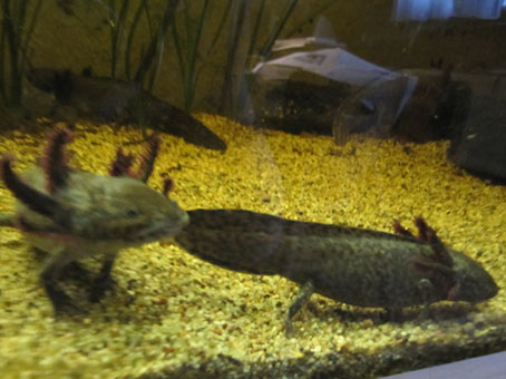
Another of my brother's pets. It is supposed to be able to breed on its own, but I think it probably knows that its children would end up being fed to other animals, so it's just sitting there on its own refusing to produce offspring.
Posted 13 January 2010.
NEWS
Look at my news page for recent work, as I've been too busy with all kinds of work to update this page regularly.
Posted 08 December 2010.
DIAGRAM
Posted 26 July 2009.
READING
While trying to figure out what I'm going to write about in my research paper, I've been reading A year with swollen appendices by Brian Eno (with which I haven't gotten very far) as well as several books about the work of Marcel Broodthaers — and I came across this rather nice quote by him:
Ce qui m'intéresse, c'est Ingres
Ce n'est pas Cézanne et les pommes
Also on my current reading list is Simon Patterson's Rex Reason, which I bought many many years ago, but I stupidly never realised until recently that the original was done in letterpress — and High Noon. I'm also looking at lots of Art & Language books and reading Cory Arcangel's blog which has a very intriguing entry from 4 March 2009 about Continuous Partial Awareness, which he explains as something like multi–tasking, with the difference that in Continuous Partial Awareness you are so distracted by everything that you don't focus on anything at all.
Posted 24 July 2009.
CONSTANT PAIN
Just when I decided it's about time to put up pictures of my recent books, I discovered that my digital camera is no longer working. So I took pictures with my laptop's inbuilt camera instead. Of course the quality is rubbish, and as for some bizarre reason the camera doesn't take normal, but MIRROR IMAGE pictures, I had to un-mirror them in photoshop.
So here is one of the books I've made, Constant Pain; a collection of very silly band names. It is printed in letterpress, the pages are black ink on white paper, the book is half bound in red bookcloth and blue Canson paper with the title printed in silver ink, also in letterpress.
Click on the photo to go on a tour through the whole book.
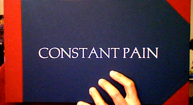
Posted 7 June 2009.
WHAT
has happened since my last entry? I've been a bit too preoccupied recently to update this regularly. I finished my book of failed etchings. Then I worked on etchings for a silly little book about spiders which I wanted to be finished for the Minipresse book fair in Mainz (21 - 24 May), but I couldn't finish them in time so made the book with ink drawings instead. Then I made a letterpress book of collected stupid band names, entitled Constant Pain, and a book called Alexandra which was based on a book of drawings I made when I was 5 years old. The original was made with a red felt tip pen, the new version is screenprinted.
I feel like preparing for the book fair distracted me a bit from other work I wanted to do, I was under so much time pressure to get all the books finished that I didn't have time to make the big animal I wanted to make. I still want to make it though.
The book fair was fairly successful, maybe not so much in financial terms, but I got a mention in the Frankfurter Allgemeine Zeitung, they had a small article about the book fair which mentioned three exhibitors by name, and I was one of them — not bad considering there were 360 exhibitors there in total!
Posted 31 May 2009.
BOOK
This is a book I made in preparation for the book of my terrible etchings that I wanted to make this week (but can't, because the letterpress studio is closed). I wanted to try out a Keith Smith binding for single pages. It is similar to a coptic binding, the spine is a bit loose though, so I'm not that happy with it — also I'm not entirely sure about the rustic look of these kinds of binding, so I think for the actual book I'm going to make sections of pages to do the letterpress on, and tip on the printed pages. I hope it will work. Well, I'm pretty sure it will, but I'm worried the spine will be rather thick.
Posted 17 February 2009.
READING WEEK
It is reading week. I intended to get on with making my book, but my attempts were foiled: I found the letterpress studio is closed until Friday. So I got some books out instead.
- Lucy Lippard The Pink Glass Swan — Selected Feminist Essays on Art
- Caroline Jones Machine in the Studio — Constructing the Postwar American Artist
They both look very interesting, and the Lucy Lippard one seems particularly relevant to my own work, with chapter titles like Making something from nothing (Toward a definition of women's "Hobby Art").
On a completely unrelated note, I just listened to Satanicpornocultshop's new uploads on Myspace, they are here: SATANICPORNOCULTSHOP. I love their cut-up madness, their terrible cover versions (like Kylie Minogue vs. Arabic Belly-dance Music) and the over-the-top happy creepy colourful collage artwork they put on their record covers.
Posted 16 February 2009.
WAG YOUR TAIL
I did a bit of birdwatching today in my lunchbreak — I was teaching bookbinding to graphic design students in Kingston, and the university is right next to the river, and there are lots of birds about. It made me realise what a terrible birdwatcher I am. I WATCH the birds alright, but mostly have no clue what they are. Or I hear them singing, but can't spot them. I think the singing ones may have been wrens. I did see some wrens too, but the ones I saw weren't singing, and I saw moorhens and mallards and wood pigeons. And there was one rather interesting bird that seemed to be building a nest in the middle of the stream, but of course I didn't know what it was. I tried later to find it in the Collins Bird Guide and "identified" it as a grey wagtail. It looked like a white wagtail, but those are black and white, and this one was yellow. Therefore I conclude it was the grey wagtail.
I don't know exactly how this is connected with my printmaking MA course, but I'm sure that it is. So there.
Posted 13 February 2009.
INTERJECTION
I'm currently sleeping in a bed where the bed-base is slightly wider than the mattress. There is a thin old futon on the bedbase, and on top of this, the mattress. So there is a strip of futon sticking out from under the mattress, which for humans is just slightly too narrow to sit on comfortably. My cat, however, can sit on it quite comfortably, and sometimes does. I'm a bit envious, because it looks so comfortable, but it isn't for me. And as I thought about this, I remembered that Georges Perec wrote something about how cats inhabit spaces. It took me a while to find it, but here it is: it's in section 4 of the chapter "The Bedroom" in the book Species of Spaces and other pieces:
Placid small thought No. 1
Any cat-owner will rightly tell you that cats inhabit houses much better than people do. Even in the most dreadfully square spaces, they know how to find favourable corners.
Posted 13 February 2009.
MAKING A NEW BOOK
I met Velmoet yesterday to talk about working together (we are going to bind the catalogues for a group of full-time printmakers who want them for their final show), and she showed me two books she was going to show in her crit. They were beautiful, quite small and delicate. And although I had planned to do something completely different this week (although I've already forgotten what that could have been), this inspired me to make a book myself.
My idea was to take all my rather mediocre attempts at etching and put them together in a book. I went to the Letterpress studio today and wanted to start making it immediately, just to find that it needs much more thinking about than I first thought. The paper I used for the etchings is quite thick, and each print is on a separate sheet. So do I make a Japanese binding? That would mean it doesn't open very well, so do I make a crease near the sewing on each page, so it can be opened a bit more easily? Or should I consider a different binding altogether?
I have to figure all of this out before I start making any more pages for it. But the basic idea is all there: I will make a cover out of bookcloth, which is printed on with letterpress. The title is: "If I were to show you my etchings, would you run away screaming?" — although I have yet to decide if I want to put that whole sentence on the front, or "If I were to show you my etchings..." on the front, the rest on the back, or perhaps make a cover where you have the first part on the front cover, then you open it and find another cover that opens to the right which has the rest of the sentence on it. Inside, there will be one page of text, then an image, then text, then image etc. — but here I need to decide if I add extra pages to print the text on, and have each page printed only on the front, or if I'll just print the text on the back of the failed etchings.
I want this to be a very quick project, partly because I have so many long-term ideas and projects that are just dragging on and not getting anywhere at the moment, so I thought it would be good to stop worrying about them and make a few pieces of work very quickly. So I hope to finish the book early next week.
It did not occur to me immediately, but I realised that this idea may very well be directly inspired by a Joseph Beuys piece I saw in the Pinakothek in Munich in January. There was a whole room full of his works, and one piece was a little photo on the wall, showing a sculpture that he had attempted to do which went badly wrong, and it was crossed out. I didn't pay that much attention to it, my boyfriend pointed it out — what a genius idea to document your failed attempts and in the process making a new piece of work!
Posted 13 February 2009.
WORK IN PROGRESS
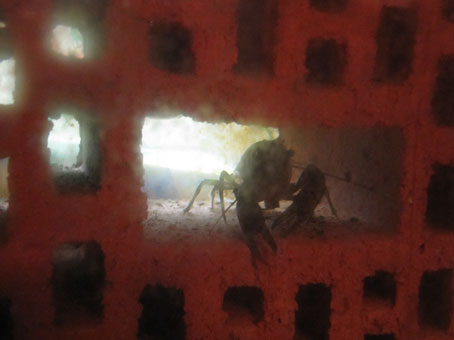
In Regent's Park, early January 2009. Click to find out more about this strange being.
Posted 12 February 2009.
WHAT HAVE I BEEN DOING?
I haven't updated this in such a long time, I'm not sure where to start now. I've been spending time in the etching room, trying out hardground, softground, aquatint, with mixed results — nothing good enough to bother putting on here just yet! So instead of writing about my own work, I'll write a bit about that of others which I've seen recently and found inspiring in one way or another...
In December I went to a Ray Harryhausen book launch. I was glad I'd bought my ticket the week before, as it was sold out on the evening — and imagine how happy I was sitting in a crappy little lecture theatre surrounded by geeks and listening to Ray Harryhausen's anecdotes about starting to make animations with his father's help (his father made the armatures). And in the end I was so starstruck that I bought a book (An animated life) and queued up for half an hour to get it signed — mainly just so I could get close to Mr. Harryhausen's desk, where he had one of the ORIGINAL SKELETONS FROM JASON AND THE ARGONAUTS! It was very small, and very amazing. I'm glad I went — Ray Harryhausen is 88 years old, and I don't know that there will be many more opportunities to see him.
My Ray Harryhausen book now lives next to a book I got for Christmas, it's written by Martin Auer and illustrated by Linda Wolfsgruber, whose work I like very much (sadly it's not easily available, her books are mostly published in Austria only and have to be mail-ordered), it's called "Von den wilden Frauen" ("Of the wild women"), and it contains stories about a mythical tribe of women called "die Saligen". They live on a mountain in rural Austria and they come into people's houses at night and do housework for them. When the people who live there notice someone's been coming and helping them, they eventually leave money or some other form of payment for the woman — and when she finds it, she goes away and never comes back.
The illustrations are done in different techniques, some etchings, some ink drawings / gouache / watercolour (I'm guessing, as I'm not sure how some of them are done) — there's something slightly menacing about them, there are silhouettes of women, some human / animal hybrids, a beautiful picture of two lynxes flying through the air, and lots of creatures with horns. Goats, moths, cats, women, and one woman with a bird's head. Pictures of bird-people always remind me of Loplop. I'm not sure who depicted people with bird heads before Max Ernst did — of course the Egyptians did, but apart from that I'm not sure what the history of bird-people is, if there is one. (There is a story about Max Ernst that I like: he had a pet bird when he was little — and then one day his little sister was born, and the bird died. He thought it was her fault, that the bird had to go because she arrived.)
In January I saw the Marcel Dzama exhibition in the Pinakothek der Moderne in Munich. It was rather small, but had some good things in it: I particularly liked a little diorama with a wounded bear lying on the ground, and lots of bats hovering above it, watching over the injured bear.
As it was rather expensive to visit the Pinakothek, and you could only get one ticket to see everything, I tried to see everything to make it worthwhile — and the space is so huge, it took me ages to see it all. One thing I liked was a handmade sketchbook that belonged to Jackson Pollock — it was about 4"x12" in size, made of 40 sheets of cream-coloured Japanese mulberry paper, bound in a type of Japanese binding called Noble Binding (Koki Toji, apparently), and it had ink and felt pen drawings.
There were also some pieces by Rosemarie Trockel that were good, machine-knitted Rorschach test pictures.
But now it's time to sleep.
Posted 12 February 2009.
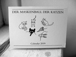
A CALENDAR
This is a calendar I made recently. I had three drawings of cats wearing masks, pretending to be other animals, that I made earlier this year for my friend's wedding invitation. She had given me a list of animals that were acceptable for her invitation, and she specifically pointed out that she did not want any cats on it, as she is quite obsessed with cats (just like me) and she thought having them on her wedding invitation would be going one step too far. So I decided to simultaneously follow her brief and completely ignore it by drawing cats pretending to be other animals.
And as I liked them so much, I decided to make some more and make a calendar out of them. Click to see more.
Posted 29 November 2008.
MY NEW BLOG.
I'm going to attempt to write a blog accompanying my MA Printmaking. This is my first entry, in which I have nothing in particular to say other than this is the beginning of my new blog.
Posted 29 November 2008.
